Car buyers chose function over flash in auto Web sites
What makes a great auto maker Web site?
Flashy car pictures? Videos of speeding cars or SUVs truckin’ along mud covered rought roads? Hardly. According a recent survey conducted by J.D. Power and Associates Canada.
Nestor Arellano
The survey company found a definite link between online experience satisfcation and people heading to the auto showrooms for a test drive. However, in my story, Ryan Robinson, the company’s industry practice leader, reveals that a lot of car makers have their Web strategy all wrong.
“Of course buyers want to see beautiful Web sites. But the main reason the visit the sites is to get information that will help them make a purchasing decision,” he said. In other words: Flash is fine but we want functionality.
When asked to rank the site experience satisfaction on a scale of 100 to 1,000 respondents placed the following automakes in the top five position: Lexus (843); Mazada (825); Toyota (822); Suzuki (817) and Audi (808).
The bottom five was made up of: Mitsubishi (777); GMC (775); Cadillac (766); Chrysler (760) and BMW (757).
Here’s what consumers are looking for in a good auto Web site:
Ease of navigation – Well laid out sites score high with consumers. Online users want to have easy access to features and information. People don’t like to drill down through layers of subject headings and pages.
A very popular site option is the “3-box layout”. It makes use of a permanent navigation bar at the top of the page that shows a few general sections that users can visit.
The middle section of the page could sport a “dynamic display.” This could be a rotating image of a car (probably the top of the line or most popular model). Parts of the machine could serve as navigational links or reveal outstanding features of the car when touched by a cursor.
“Data shown could relate to horse power, top speeds, or lease rates and rebates,” said Robinson.
The lower section of the page could include another row of permanent navigational buttons that provide a static link to less frequently searched sections.
Roll over menus revealing several navigational choices when simply touched by a cursor help reduce site clutter. This feature also cuts down the number of sections users need to click through.
Provide for browsing and comparison – The whole idea of using a Web site is to be able to browse and compare models without having to drive to the showroom and face the pressure from pushy salespeople.
Yet the J.D. Power survey revealed just 28 per cent of site visitors said they were unable to perform vehicle comparison on the Web sites. The survey also showed when vehicle comparison could not be made, overall Web satisfaction dropped to 759 from an average index score of 813 when comparison was possible.
Site visitors also wanted to be able to equip a vehicle online and then get a price quote on how much upgrades would add to the total cost of the vehicle.
Replace Flash with functionality –
Beautiful Web sites with sleek images and fancy videos may look great but consumers would rather have fast loading pages and useful applications.
Manufacturers need to strike a balance between Flash and functionality, according to the survey. Ultimately, buyers look for a site they can use, as opposed to one they can simply view.
Multi-tasking is the ticket – The site has to be relevant to the consumer. The survey shows online credit applications are no longer a novelty, but an expected option for online users.
Other options online customers want include:
- Scheduling a sales appointment (76 per cent);
- Completing a credit application (72 per cent);
- Requesting a price quote from dealer (66 per cent);
- Obtaining a brochure of a vehicle (58 per cent);
- Locating a vehicle at a dealership with an inventory locator tool (51 per cent);
- Access to local or independent dealer sites (38 per cent)
- Investigate discounts, sale offers or rebates (37 per cent)
- Use the search tool to help locate information (33 per cent)
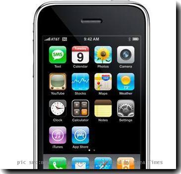
Mobile Web access – Around 26 per cent of those aged 46 and below are looking for , according to Robinson.
“I think it will be increasingly important for manufacturers to develop sites specifically designed for the smaller smart phone screens,” he said.
As smart phones gain more features and functionality, he said, consumers will develop the habit of browsing for products on their handsets.
mobile
 height="38" width="41" id="EXim" alt="eXTReMe Tracker" />


